Red River Retreat logomark — an interlocking R formed from three woven strokes

Red River Retreat

Client
Tonoy Hospitality Pvt Ltd
Category
Digital + Print
Year
2025

Art DirectionBrand Identity

  • Nomenclature
  • Collaterals
  • Menus
  • Signage
  • Wayfinding

The client came to me with a logo, they wanted me to take over the rest of the Direction and Identity _ I named each restaurant, café and common area, then designed their logos, all the menus, the wayfinding and signage, the full stationery and collateral suite, right down to the housekeeping cards.The intent was a luxury that feels organic _ an identity woven into nature, the way the resort's architecture settles into the Kaziranga landscape rather than standing apart from it.
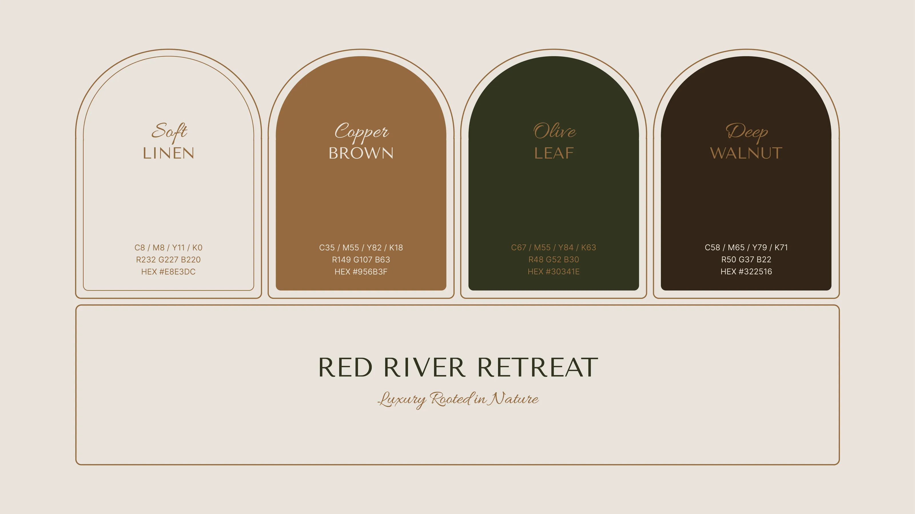
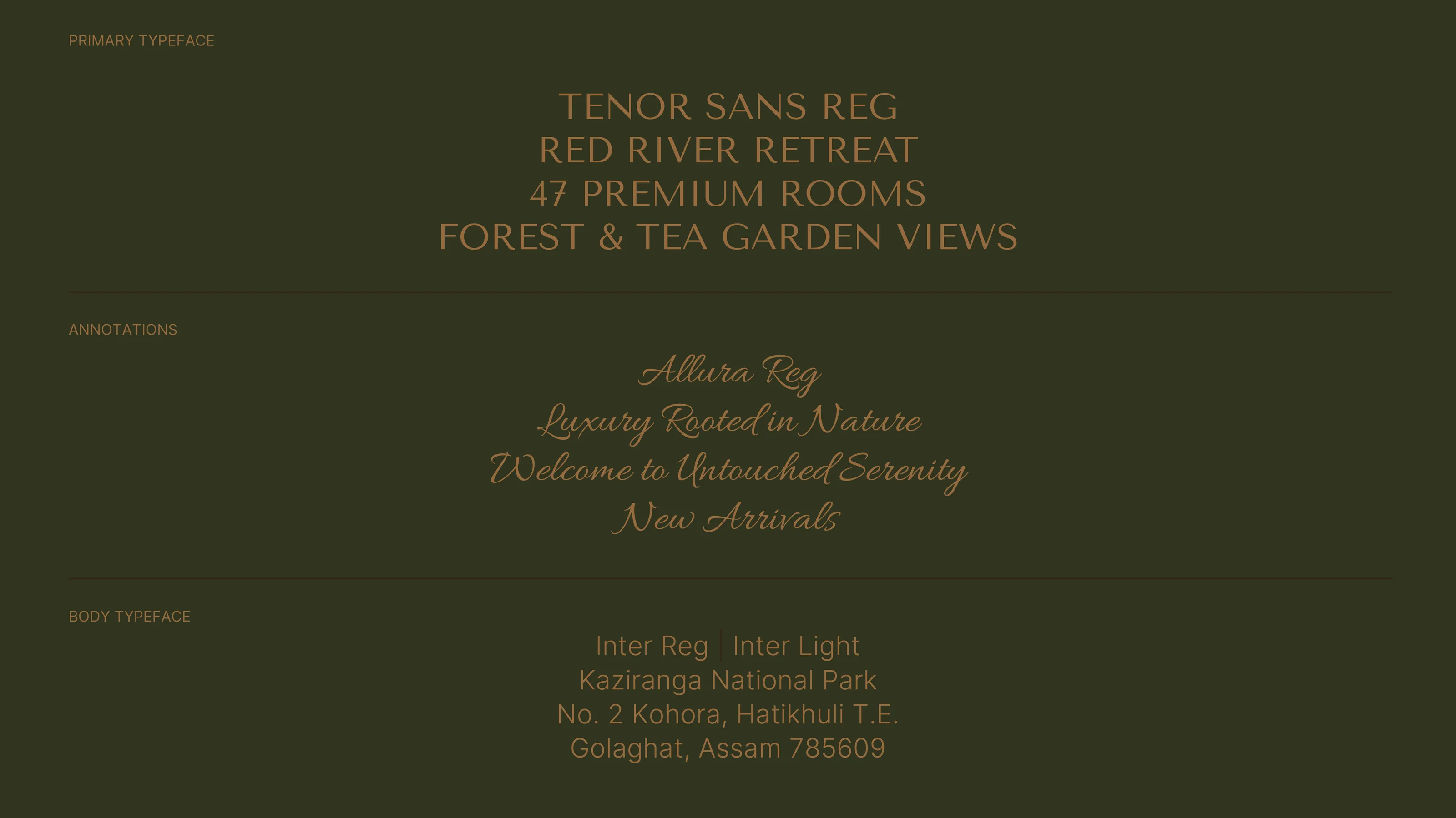
Brand colour palette: soft linen, copper brown, olive leaf and deep walnut
Typography system pairing an elegant serif for headlines with a script and a clean body face
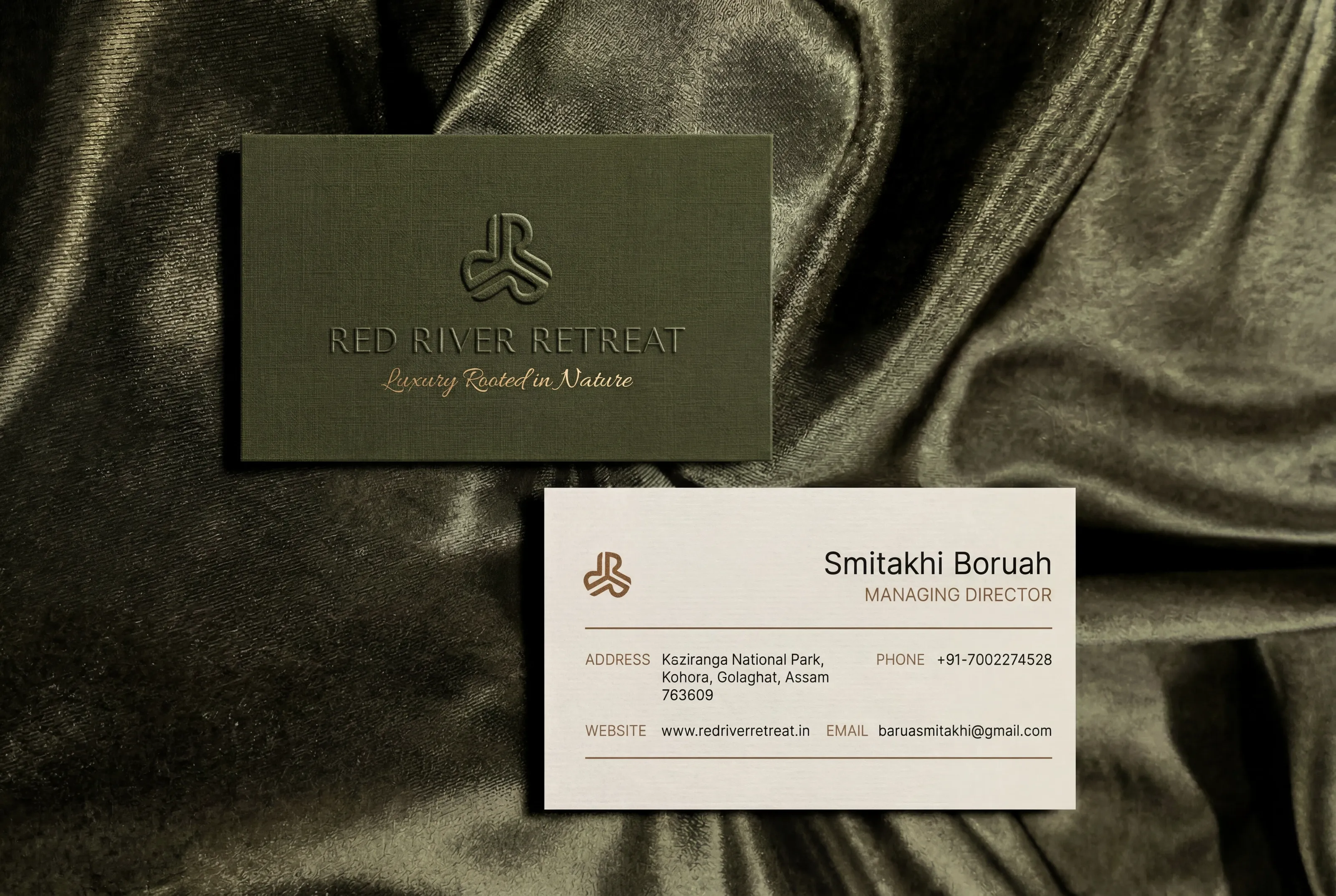
Foil-stamped business cards on olive linen stock
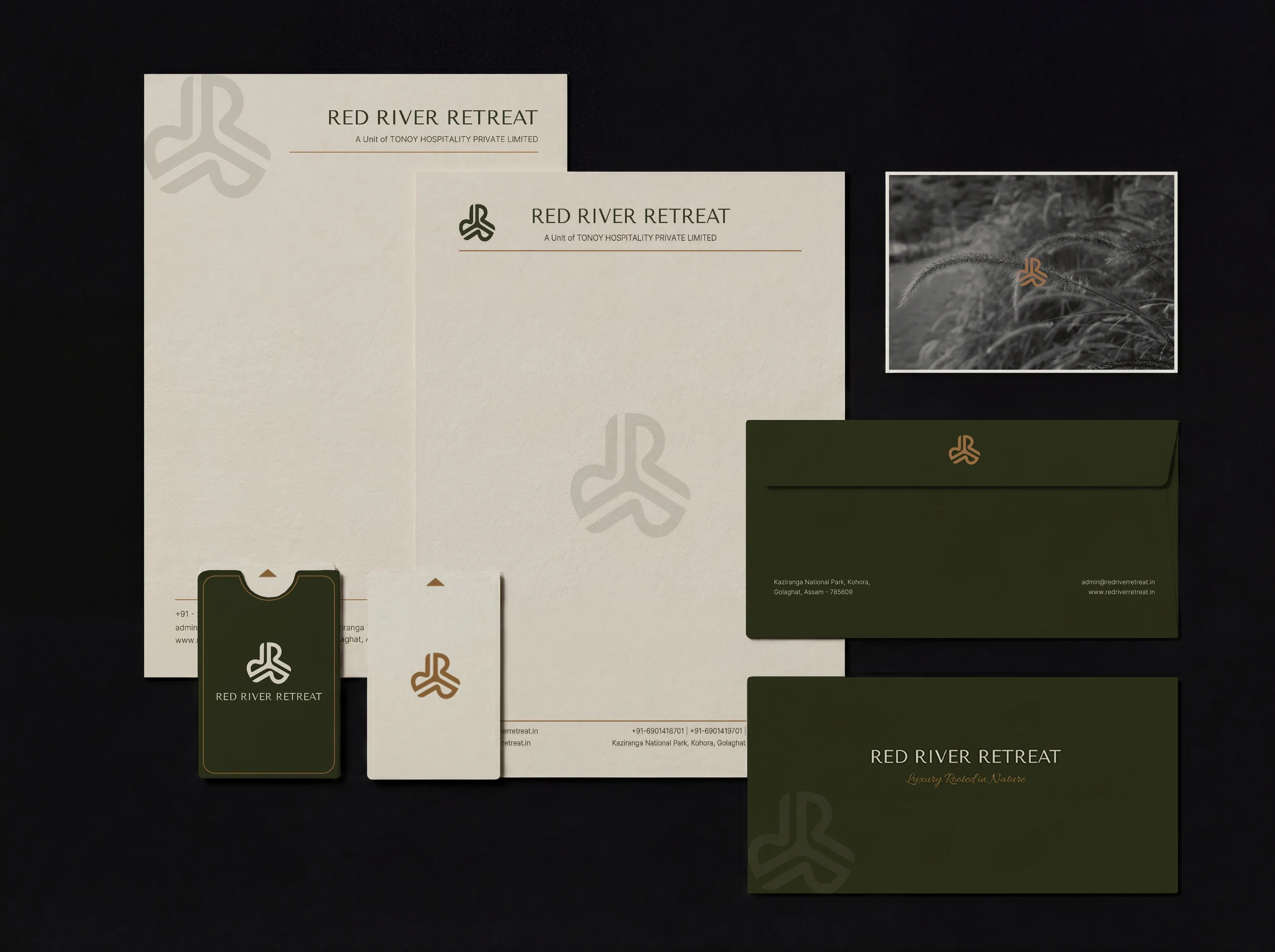
In-room stationery suite: letterheads, envelopes and key-card sleeves in linen and olive
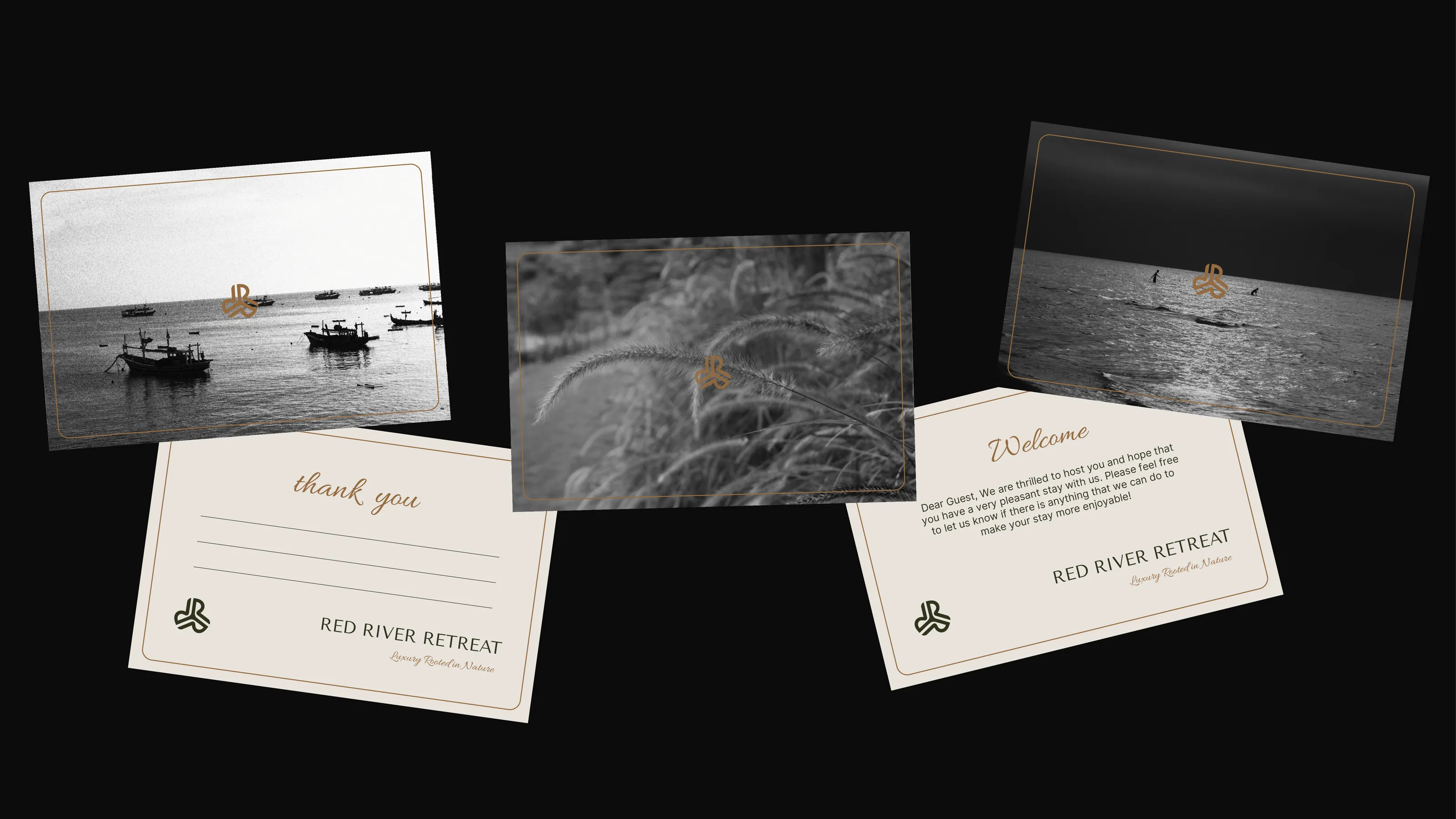
Guest welcome and thank-you cards featuring monochrome landscape photography
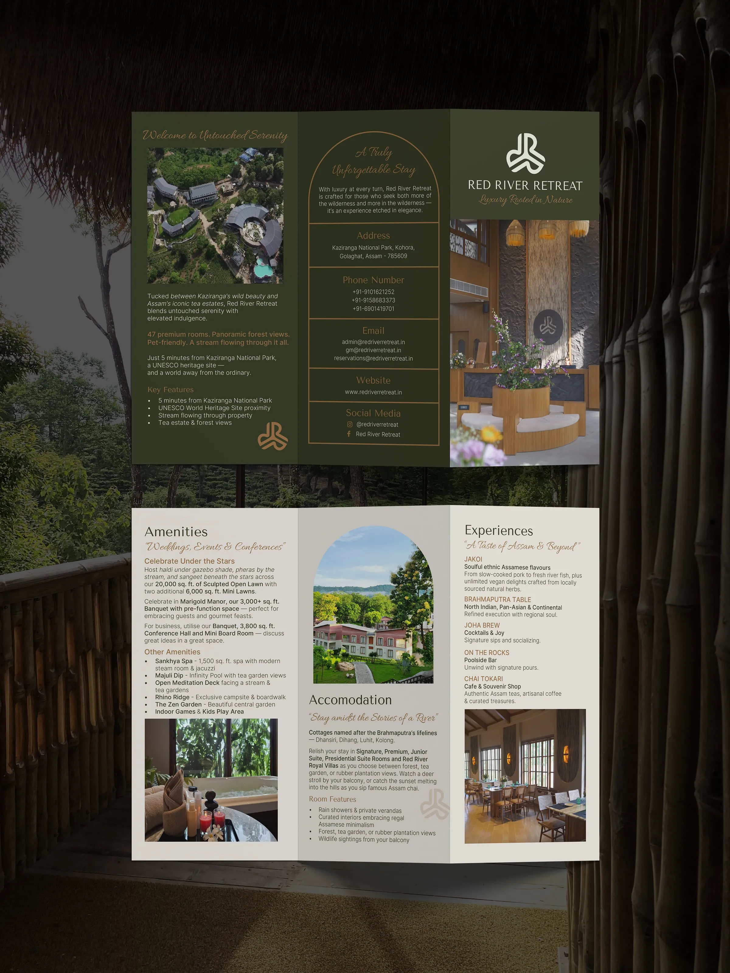
Tri-fold property brochure spread covering amenities, accommodation and dining
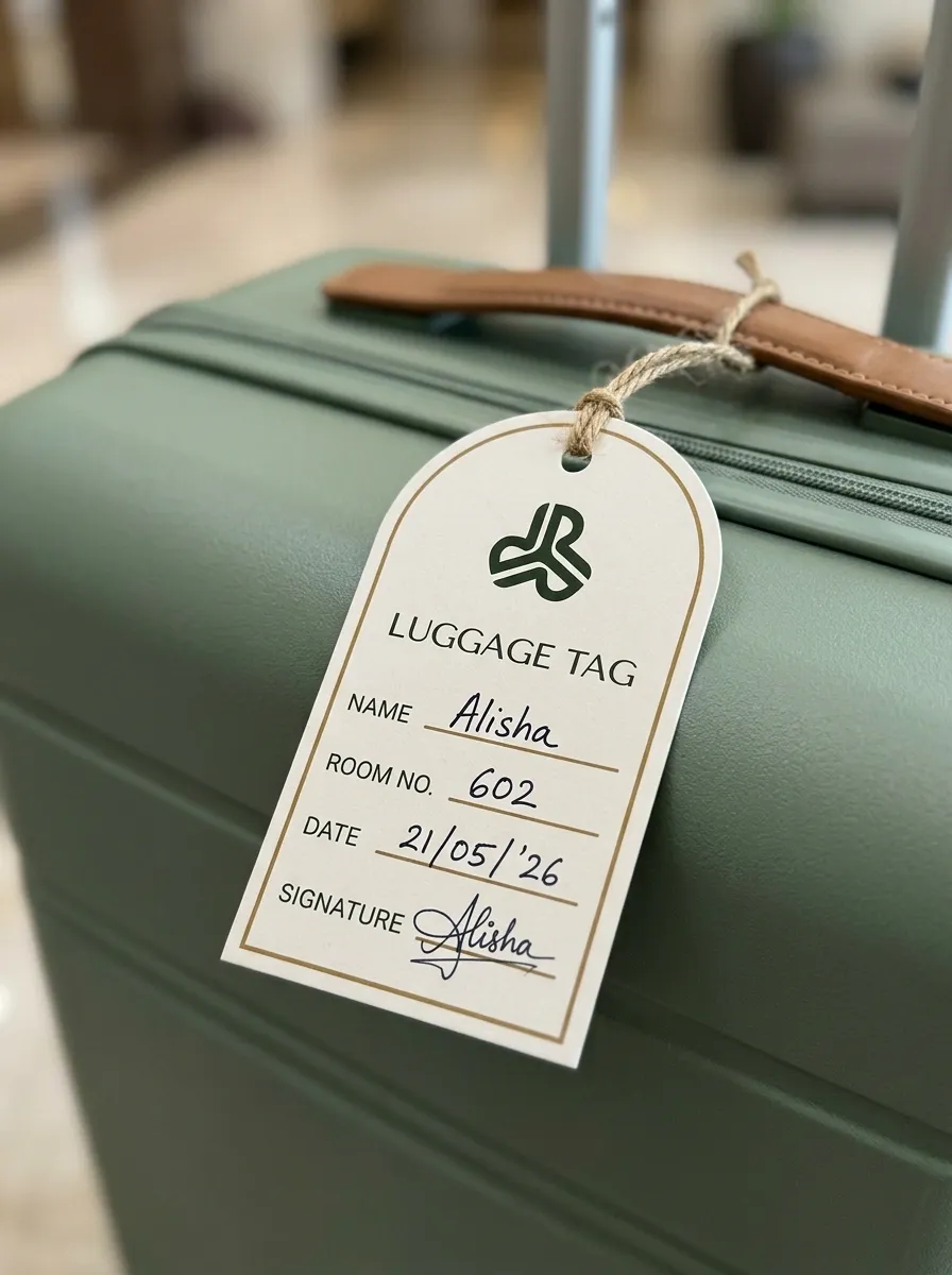
Guest luggage tag with room number and signature line
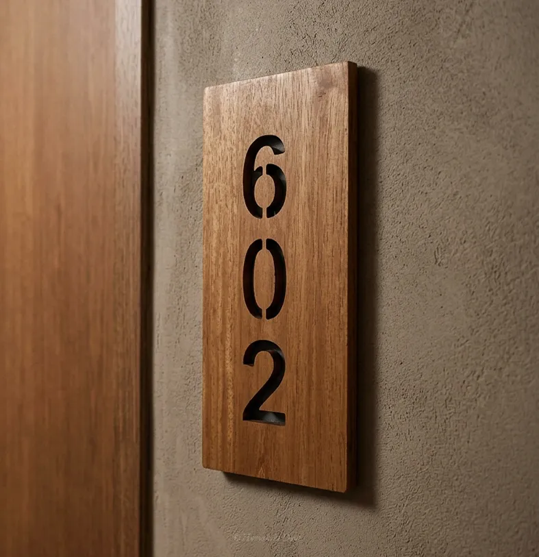
Room-number door signage — cut timber numerals on textured plaster
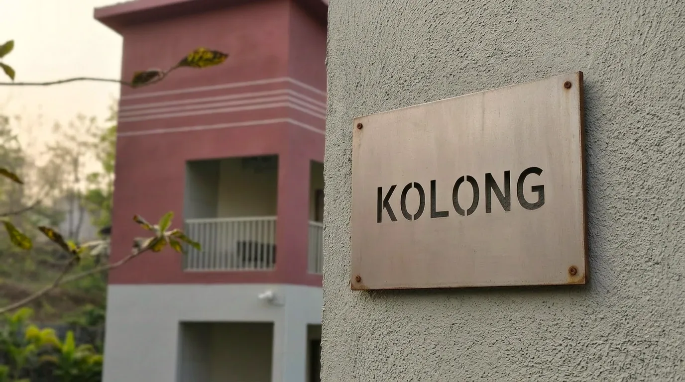
Common-area directional signage mounted on an exterior wall
Timber wayfinding sign reading “Kolong”, naming a guest block after a Brahmaputra tributary
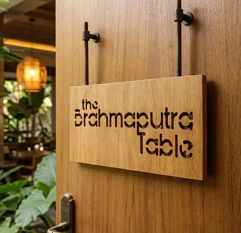
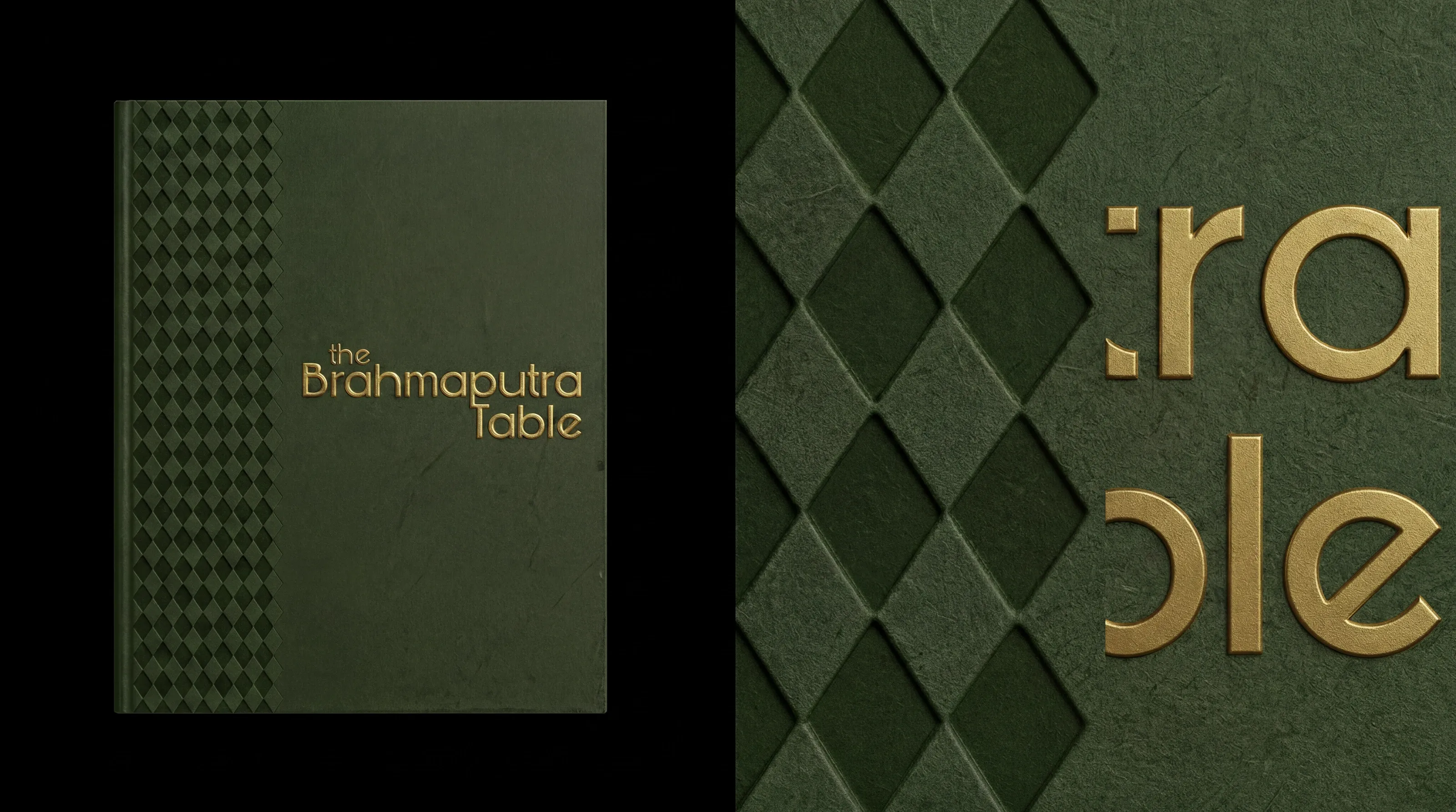
The Brahmaputra Table restaurant menu cover
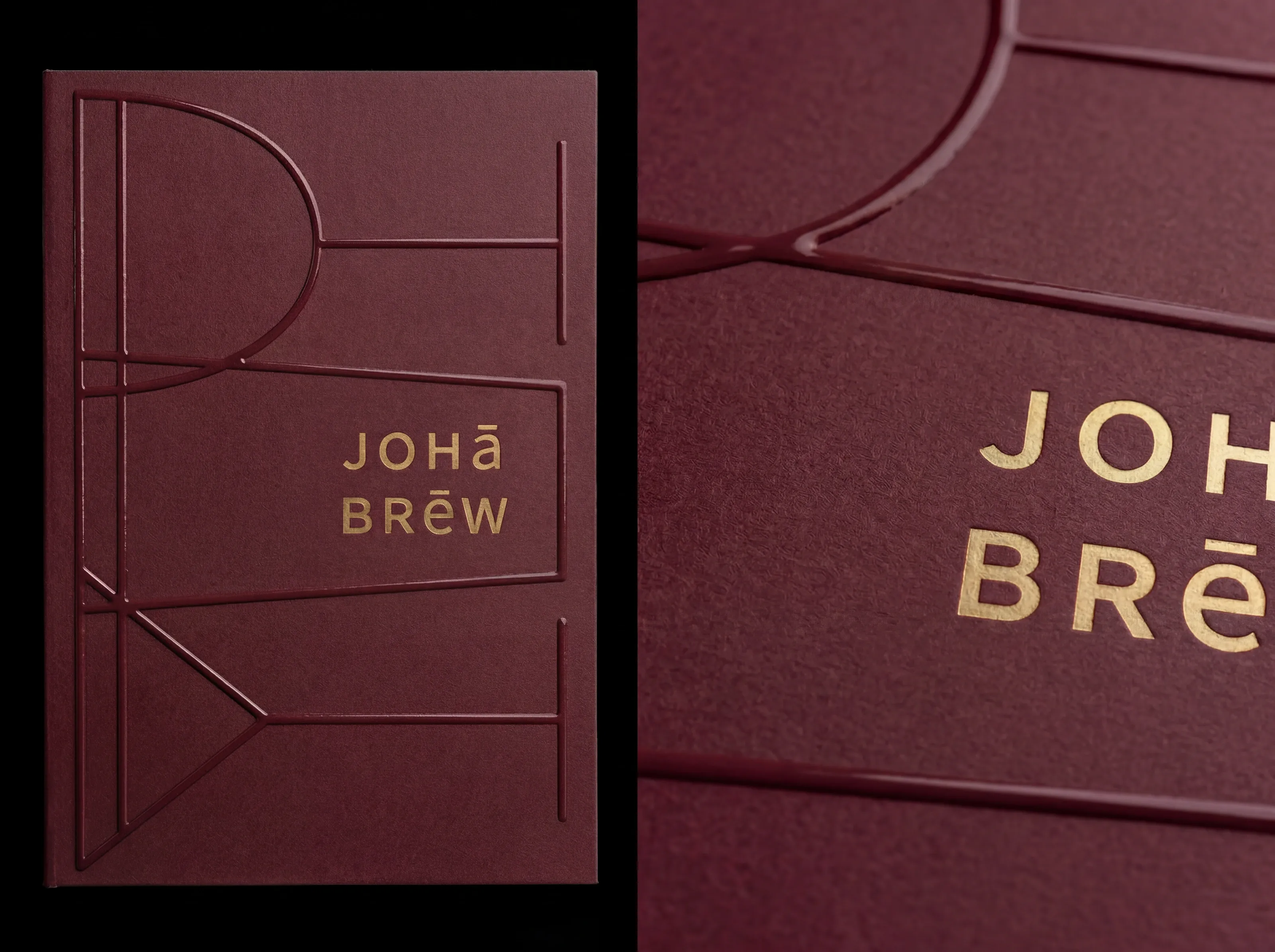
Joha Brew menu cover detail — deep maroon cloth with gold foil line-art and wordmark
Joha Brew menu — flip-through
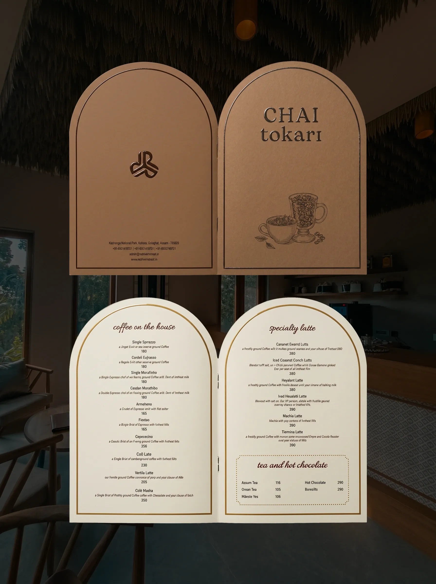
Chai Tokari café menu photographed open, staged in the café
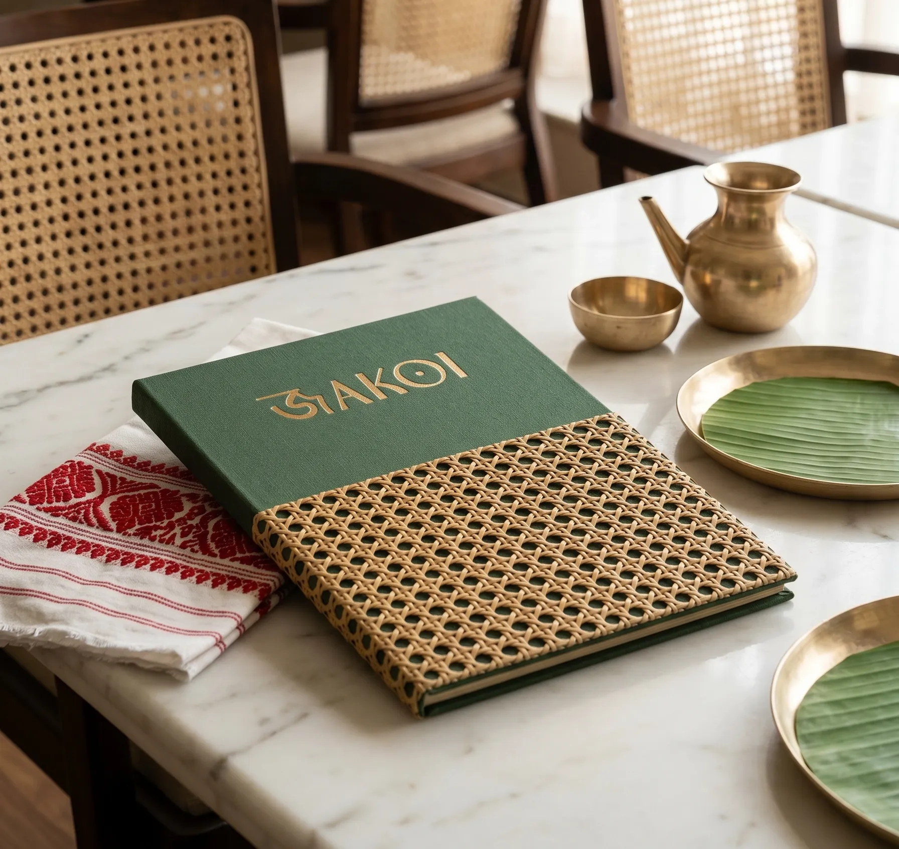
Jakoi restaurant menu in green cloth and cane weave, styled with brass tableware and a gamusa cloth
Jakoi menu — flip-through
NextPawxpress